Create That UX Project: Belco
About the Project
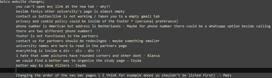
This project was about redesigning the BELCO website, a platform aimed at university students, similar to Erasmus. The client asked for a modern, functional, and user-friendly website that improves the overall student experience. They mentioned that the current site had several bugs and lacked optimization. Our task was to identify these issues and deliver a smoother, more engaging redesign.
Problems & Fixing Ideas
Their existing website was over 10 years old, and they were looking for a fresh, modern redesign to better represent their organization.
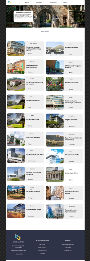
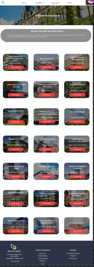
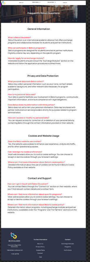
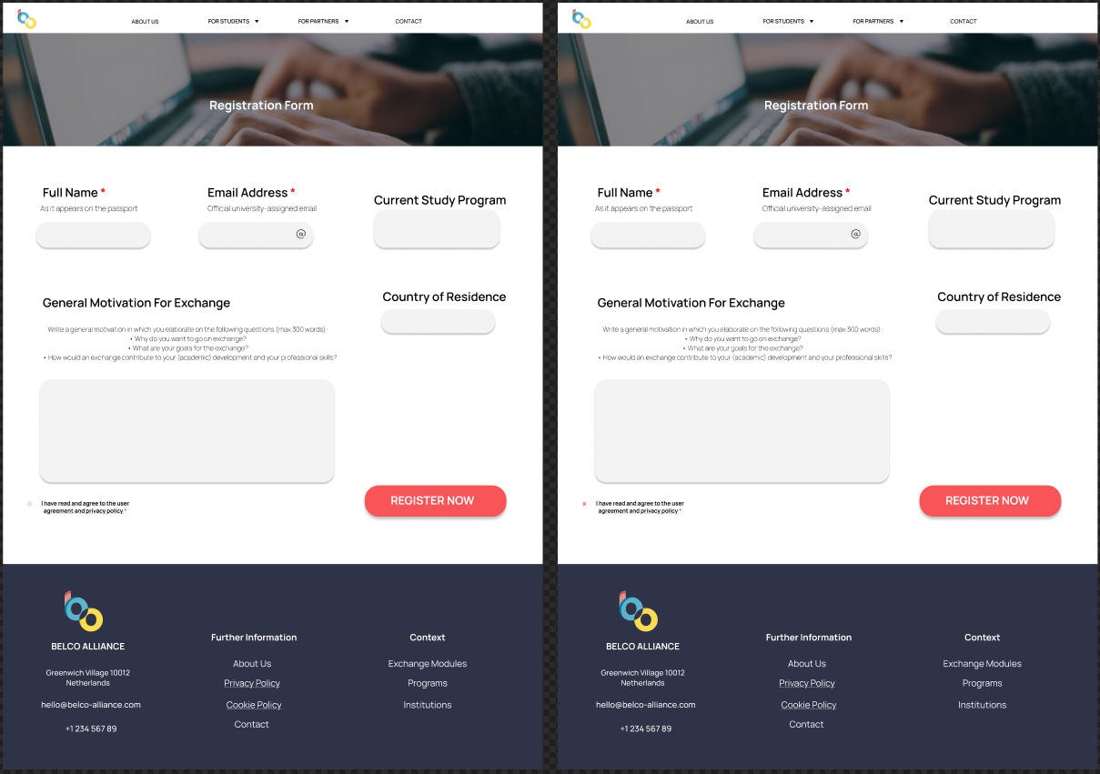
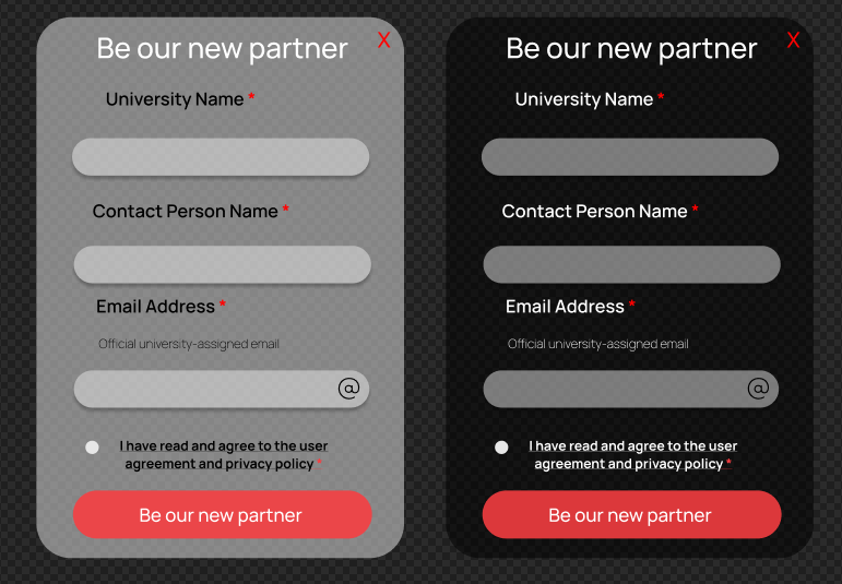
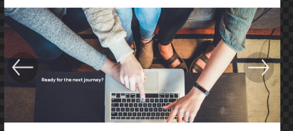
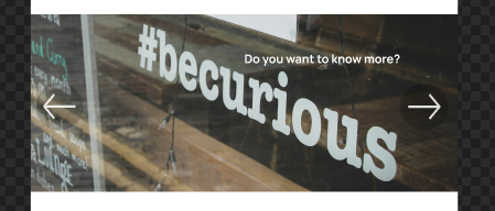
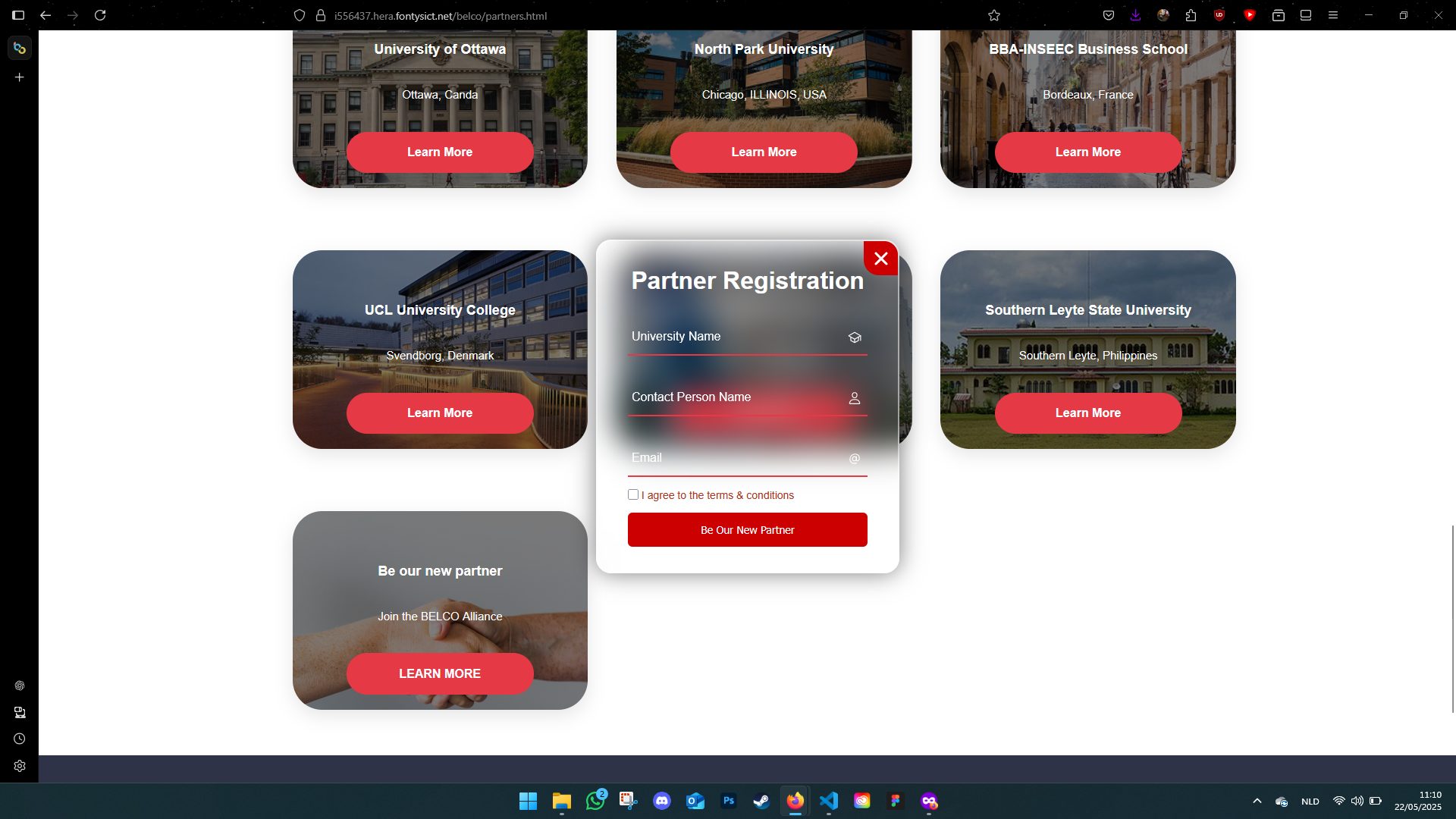
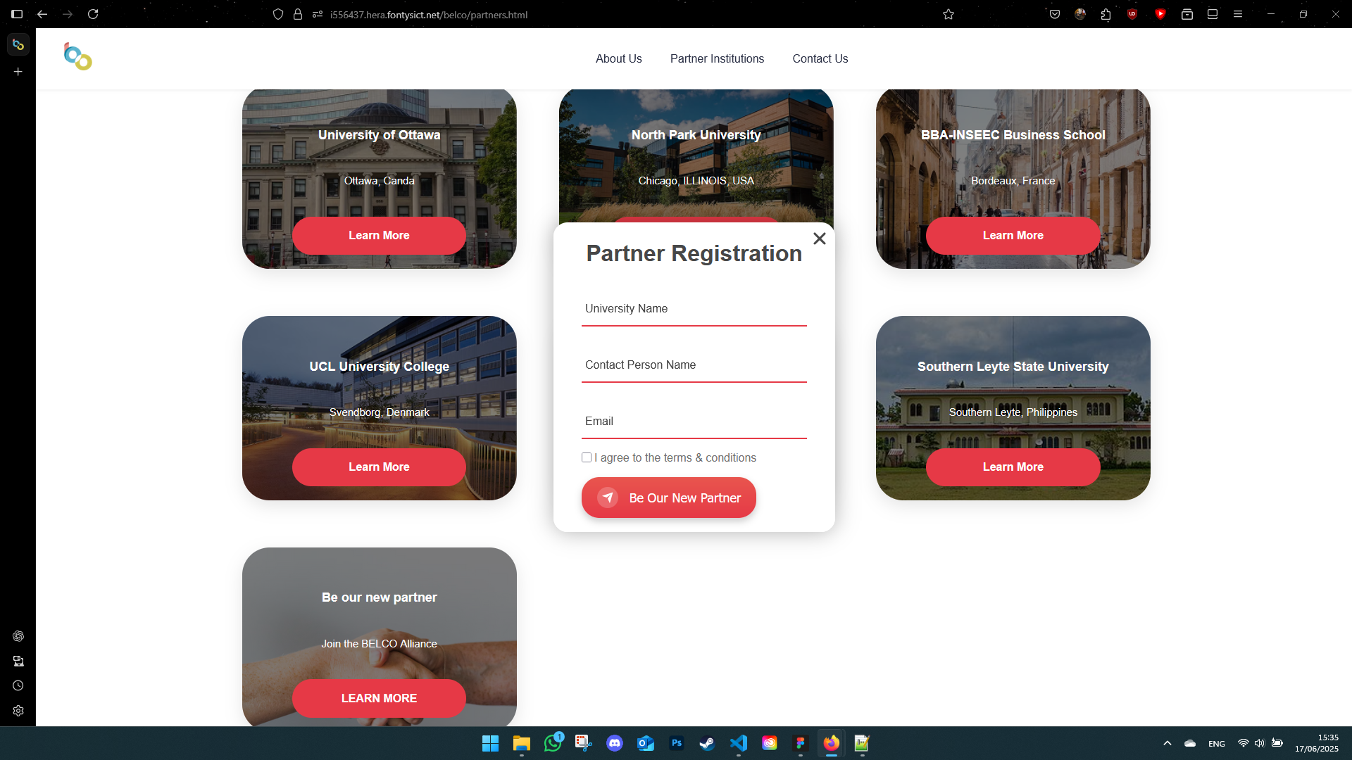
We jumped into prototyping right away. My responsibilities included designing the Partner Institutions page, the FAQ section, and the Registration Form. I also added an image slider to the homepage to make it more engaging.
Planning & Workflow
We used Trello to organize our tasks. Having everything visualized helped me stay on track and work better in a team. I also got better at estimating how long certain tasks would take me.
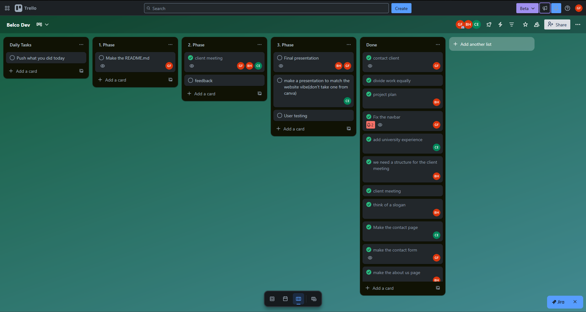
Besides that, we also created a team agreement to set clear expectations and responsibilities from the start.
Working with the Client
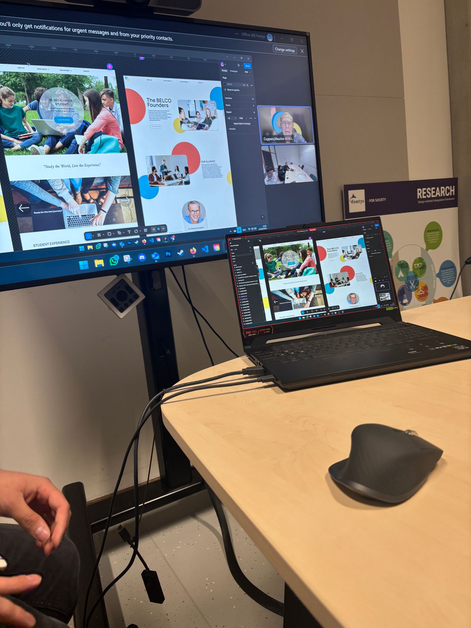
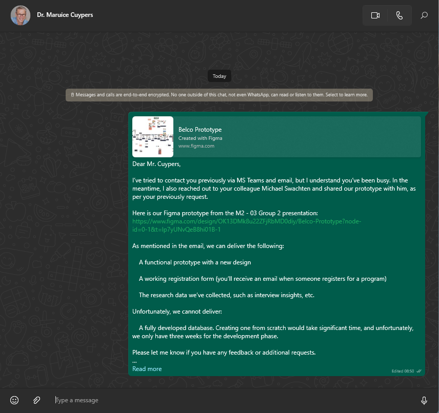
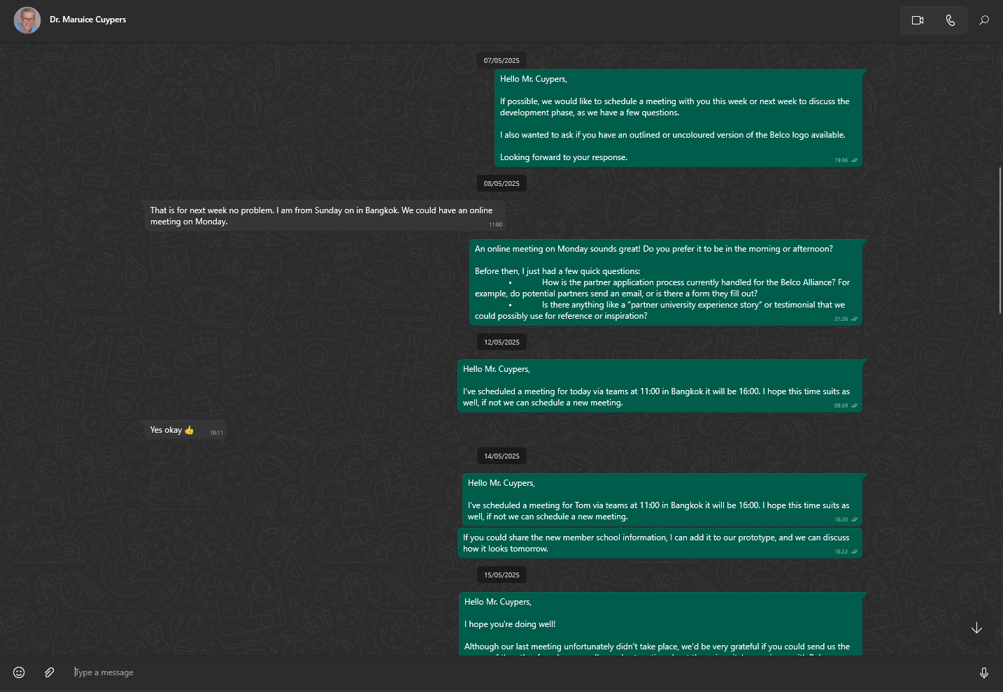
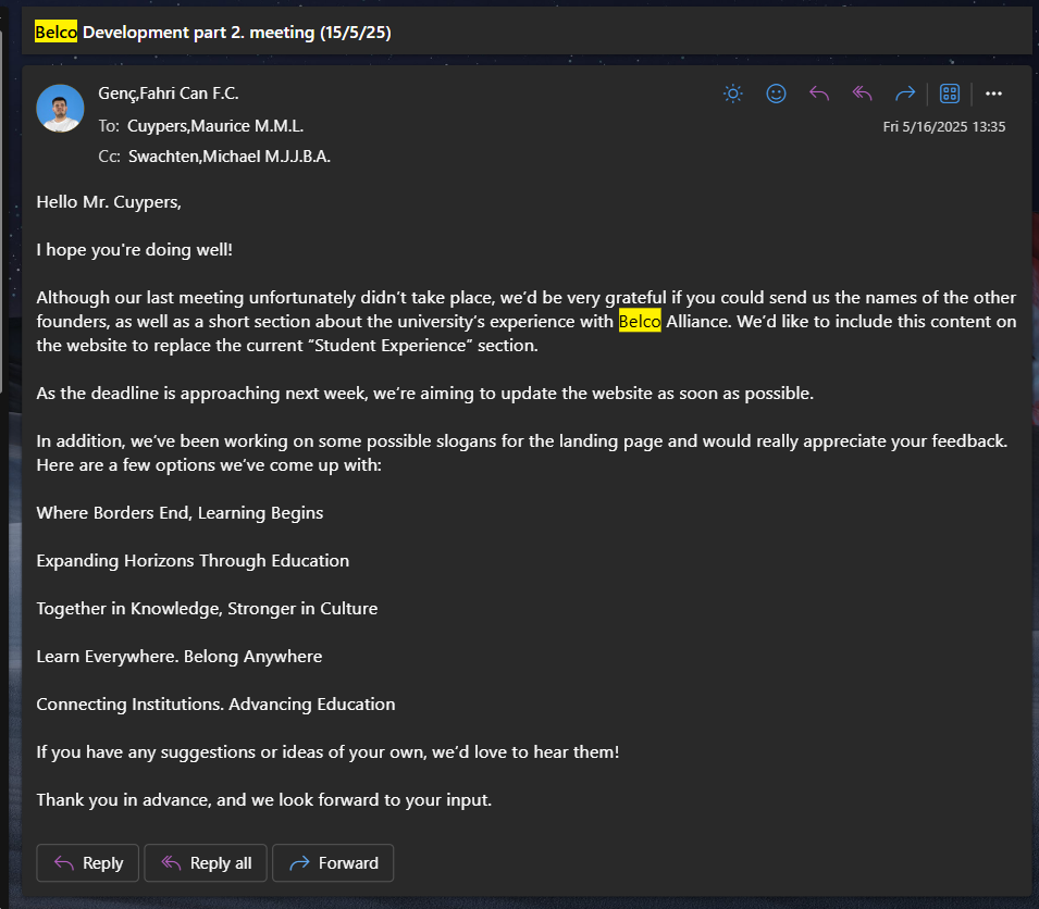
We had multiple meetings with Maurice, the Belco project lead. I was a bit nervous at first to speak during these, but I pushed myself to ask questions and explain our progress. He was really open to ideas, especially when we suggested new sections like "Founders" or adding more student stories.
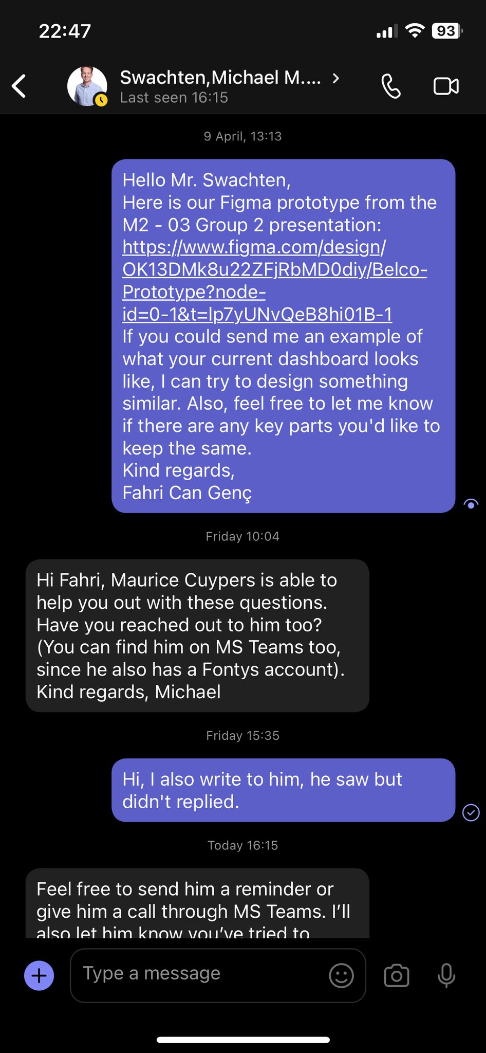
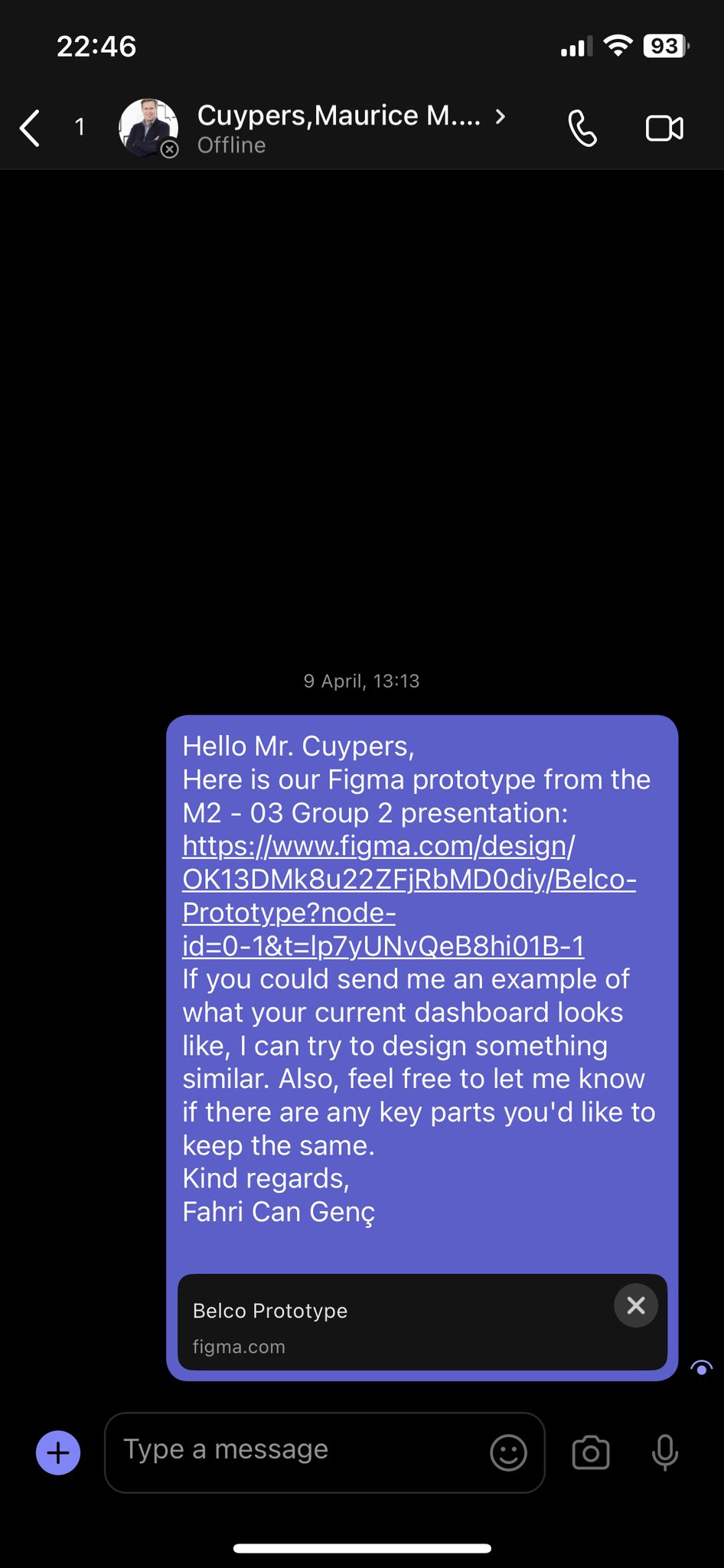
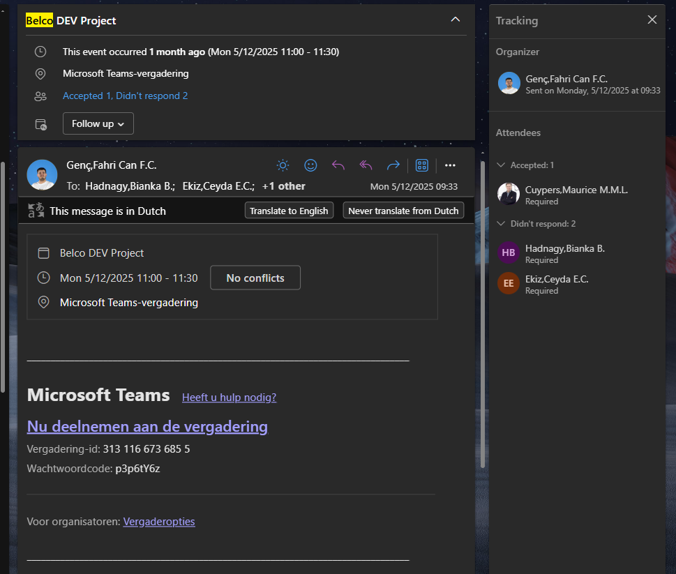
These meetings taught me how to listen to feedback and also how to communicate ideas clearly — not just to classmates, but to people in a more professional setting.
Research & Learning
Before jumping into design, I did a Competitive Analysis to understand how other university alliances work and how they structure their platforms. I also looked into responsive design techniques, because I wanted to make sure our redesign worked well on both mobile and desktop devices — especially since many students or partners might be checking the site from their phones.
This research step helped me understand the "why" behind design decisions, not just the "how". It also gave me a bigger-picture view of how websites support international collaboration between schools.
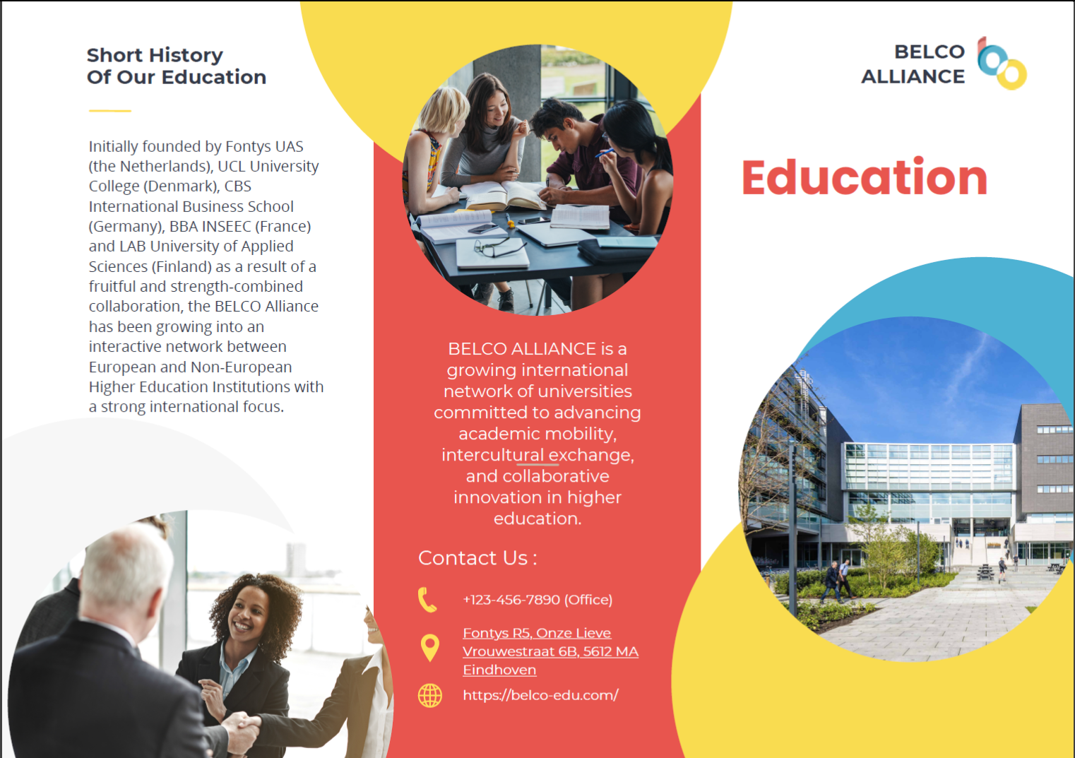
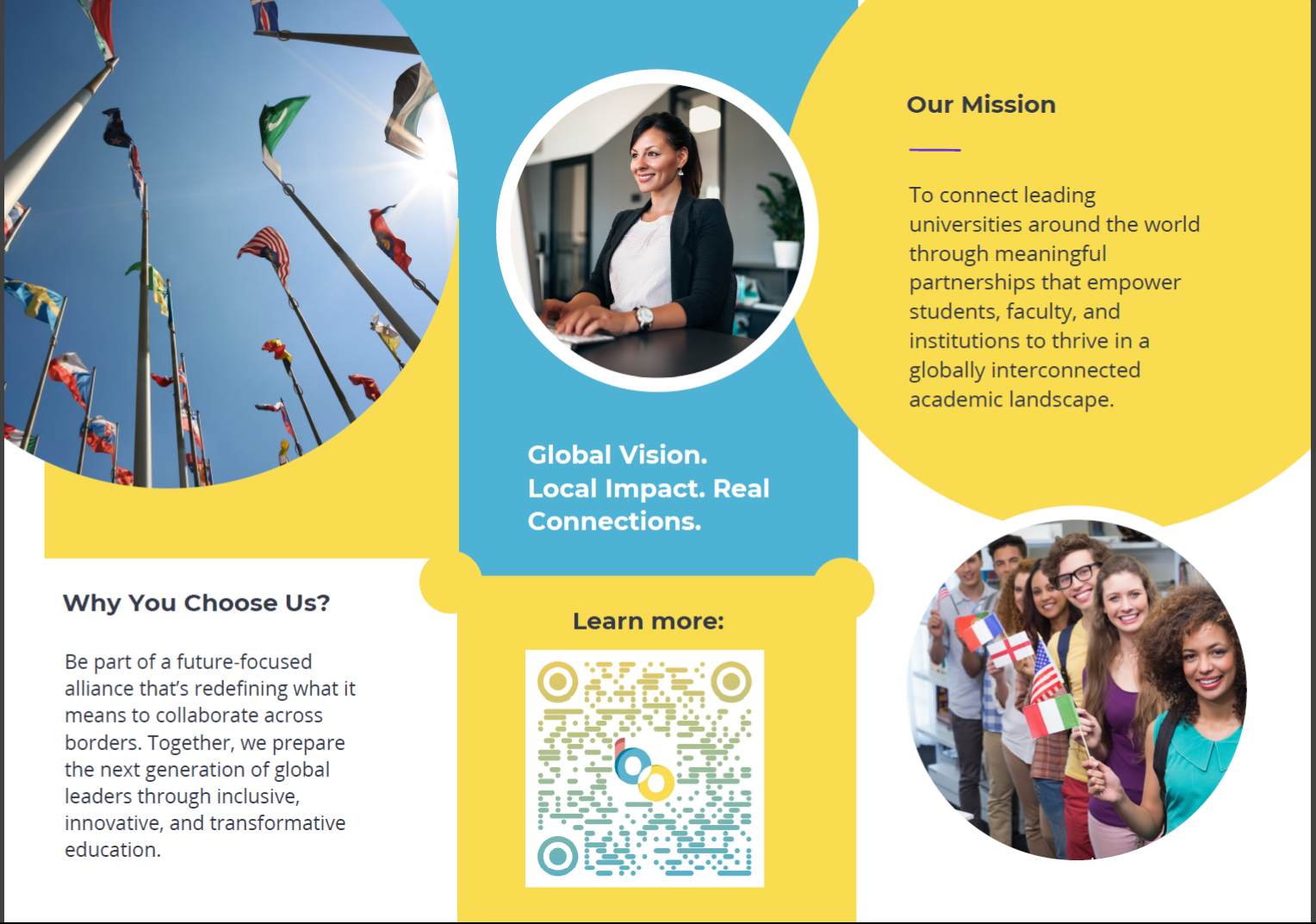
Promo Materials
To showcase the project and prove that it's mobile responsive, we created an informational flyer for the Belco Alliance. I designed a QR code for it to make the flyer interactive, rather than just a plain sheet with information. The clients really liked that idea and even mentioned they would consider using something like this in the future.
Final Presentation
We created our final pitch in Canva and presented it to the client and teachers. I was a bit nervous, but I was proud of how we walked through the design decisions step by step. The feedback was really positive. The client liked the clear layout and mobile usability — both things I personally worked on.
Development Part
User Testing & Feedback
I tested the website with Ruud Jacobs, my former internship assessor. He gave really direct and helpful feedback. I also received comments from my teammates and teachers. Dirk and Paul, for example, gave great tips to improve the registration form's layout — small changes that made a big difference.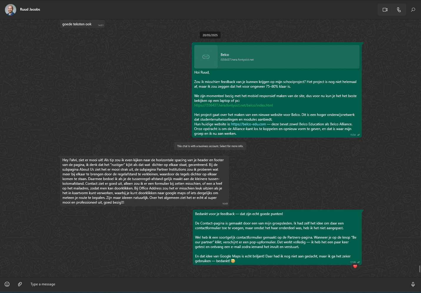
Old
New
Old Version Screenshots
New Version Screenshots
Reflection
This project pushed me in a lot of good ways. I learned that even small layout or accessibility decisions can completely change how someone experiences a site. I also learned how to give and receive feedback without taking it personally — something I struggled with before.
One of the biggest takeaways for me was confidence: in my design skills, my coding, and also in speaking up during group work and client moments. I still have a lot to learn, but this project showed me that I can handle bigger challenges than I thought.